



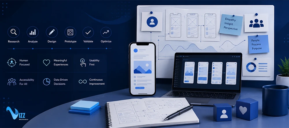
In the competitive mobile ecosystem of 2026, an application has only a few milliseconds to prove its value. If a user experiences even a moment of confusion, lag, or visual clutter, they will uninstall the app and turn to a competitor. Many product teams assume that creating a clean, modern interface is enough. However, high-performing apps succeed because they build their entire product around the actual behaviors, needs, and physical limitations of their users.
This process is known as User-Centric Design (UCD). Far from being a luxury or a cosmetic afterthought, user-centric design is a strict engineering and business requirement that directly dictates whether a mobile application succeeds or fails in the market.
This comprehensive guide breaks down how to implement a user-centric design system for mobile apps. It covers everything from measuring financial impact to aligning design and development teams in Agile sprints.
Why User-Centric Design is a Financial Imperative (Not an Aesthetic Luxury)
Many executives view design as an intangible expense. However, global market trends tell a different story. The user experience (UX) design market is experiencing rapid acceleration, growing from an $11.41 billion valuation in 2025 to an expected $13.06 billion in 2026, on its way to a projected compound annual growth rate (CAGR) of 14.49% through 2031. This massive growth proves that modern companies treat design as a direct revenue lever.
When you design with your users at the center, you directly improve the key business metrics that investors and founders care about most:
The 50-Millisecond Bias: How Visual Impressions Secure Retention
Human psychology plays a massive role in software adoption. Research shows that users form an opinion about an application’s or brand’s credibility in just 0.05 seconds (50 milliseconds). Furthermore, 94% of a user’s first impression of a business is entirely design-related. If your design feels disorganized, unresponsive, or outdated, up to 42% of users will abandon the app immediately, causing a spike in your early bounce rates.
Expert Tip: Do not frontload heavy animations or complex graphics during cold launches. Keep early interactions within a 150-millisecond budget, or visual delays will drive early user churn.
The Financial Calculus: Measuring the LTV:CAC Impact of UX
The health of a mobile app business is heavily determined by its Lifetime Value to Customer Acquisition Cost ratio (LTV:CAC). High-growth digital products aim for a minimum 3:1 LTV-to-CAC ratio.
User-Centric Design directly optimizes this ratio. By designing intuitive onboarding paths and removing sign-up hurdles, you drastically lower your customer acquisition costs. For example, replacing standard username/password inputs with modern biometric and passwordless sign-ins (like passkeys) reduces sign-up abandonment rates by 40% to 60%. At the same time, clear layouts and smooth workflows keep users engaged longer, raising your retention rates and driving up lifetime value.
UX Investment and Financial Impact Matrix
| Design Investment Area | Usability Improvement Indicator | Direct Business Impact |
| Biometric / Passkey Login | Reduces sign-up friction by 40% to 60% | Lowers Customer Acquisition Cost (CAC) |
| Progressive Disclosure Layouts | Increases task completion rates by 30% | Maximizes User Engagement and Lifetime Value (LTV) |
| Continuous Usability Testing | Reduces user flow drop-offs by half | Stabilizes monthly retention and reduces user churn |
The ISO 9241-210 Framework: Setting the Standard for Human-Centered Design
To ensure your design process is objective and reliable, it helps to align with international standards. ISO 9241-210:2019 is the global standard that governs human-centered design for interactive systems.
The ISO standard establishes that human-centered design must account for the users’ specific capabilities, physical limits, and situational requirements. Rather than relying on guesswork, the standard requires that product decisions be driven by iterative feedback.
The 6 Core Principles of the ISO 9241-210 Standard
- Explicit Understanding of Users: The design must account for the users’ specific tasks, environments, and physical context.
- Active User Involvement: Real users must participate throughout the entire design and development process.
- Evaluation-Driven Improvement: Iterations must be continuously evaluated and refined based on direct user testing and feedback.
- Iterative Process: The design must go through multiple cycles of prototyping, testing, and refinement to address complex usability issues.
- Holistic User Experience: The design must address the total user journey, including ease of use, physical ergonomics, emotional response, and utility.
- Multidisciplinary Teamwork: The design and development team must include a wide variety of skills, perspectives, and functional expertise.
Emerging Mobile Design Paradigms for 2026
Mobile design is evolving past static grids and standard layouts. To stay ahead of the competition, your design strategy should leverage modern mobile paradigms:
Agentic UX & AI-Driven Hyper-Personalization
In 2026, mobile applications are no longer static screens; they are smart, context-aware environments. With agentic UX, background AI engines analyze a user’s habits, environment, and history in real time. The app can then dynamically adjust its layout, highlight specific shortcuts, and simplify menu navigation depending on the user’s immediate context.
Multimodal Design: Blending Touch, Voice, and Gestures
Modern mobile use cases often occur when users are on the go, driving, or multitasking. Designing for a single touch input is no longer sufficient. Multimodal UX blends voice user interfaces (VUI), hands-free gestures, and eye-tracking to make sure the app remains highly accessible and easy to use in any scenario.
Passwordless Ecosystems: Friction-Free Biometric Authentication
Typing complex passwords on a small mobile keyboard is a major point of friction that hurts conversion rates. Modern mobile UCD integrates biometric logins like FaceID and fingerprints using secure passkeys. Passkeys – supported by Apple, Google, and Microsoft—have scaled to over 15 billion active accounts globally, lowering signup abandonment rates and securing user trust.
Thumb-Friendly Bottom Navigation
As phone screens continue to grow, physical reachability is a critical ergonomic constraint. Modern design systems position high-frequency buttons, menus, and call-to-actions within the lower half of the screen (the “Thumb Zone”) to reduce physical hand strain and minimize cognitive load.
Technical Alignment: Bridging the Designer-Developer Divide
One of the biggest bottlenecks in mobile app development is the “silo effect”. Designers often create beautiful mockups that are either impossible to code efficiently or exceed the device’s technical performance budget. Bridging this divide requires careful coordination between your design assets and your development stack.
Designing for Performance Budgets – Flutter vs. React Native
Cross-platform frameworks dominate modern mobile development, with Flutter representing 9.4% of production apps and React Native representing 8.4%. However, these frameworks handle design rendering differently:
- Flutter (with Impeller): Flutter draws every pixel directly onto the screen using its high-performance Impeller rendering engine. This makes it ideal for highly customized, vector-heavy micro-interactions and smooth UI transitions.
- React Native (with Native Architecture): React Native maps javascript components to native iOS and Android modules. While highly responsive, complex design transitions require careful management of the native bridge to prevent visual lag.
If your design files do not respect your framework’s performance boundaries, your app’s load times and frame rates will suffer, driving up to 42% of your users away.
The Agile UX Integration Strategy: Running UCD in Bi-Weekly Sprints
To keep your mobile app project moving quickly without sacrificing user research, you should implement a Dual-Track Agile framework. This methodology runs design discovery one step ahead of the active coding sprints to avoid bottlenecking developers.
Here is how to execute this process in four clear steps:
- Step 1: Run Dual-Track Discovery (Sprint N-1): The UX team maps out customer journeys, conducts navigation tests, and builds interactive prototypes one full sprint ahead of development. This ensures that when developers start writing code, they are working from fully vetted designs.
- Step 2: Conduct Technical Feasibility Reviews: During the middle of Sprint N-1, developers audit the Figma designs. This quick check flags any complex UI assets, custom fonts, or heavy animations that might exceed the performance budget.
- Step 3: Build and Test Concurrently (Sprint N): While developers write code for the finalized designs during Sprint N, the design team runs automated remote usability testing on current builds to ensure the visual layout behaves as intended.
- Step 4: Execute Post-Sprint Session Audits: Once the sprint features are deployed, the product team analyzes actual user session recordings and heatmaps. This data highlights any unexpected friction or drop-offs, which are added back into the product backlog for refinement.
The Mobile UCD Prototyping & Testing Tech Stack
To build a reliable user-centric ecosystem, your team needs the right tools. A modern mobile design stack should focus on two main areas: prototyping and iterative testing.
Modern Prototyping: Figma and Principle
- Figma (Design System Source): Figma serves as the single source of truth for your app’s visual identity. Product teams leverage Figma’s variables to build responsive component libraries, automated spacing guidelines, and dark-mode themes that scale seamlessly.
- Principle (Interaction Control): To test complex transitions, designers export assets into Principle. This tool allows designers to create high-fidelity, interactive prototypes with exact animation curves, tactile feedback, and realistic gesture responses.
The Three-Pronged Testing Architecture
To gather reliable feedback throughout the life of your mobile app, you should combine three distinct testing methodologies:
- Tree-Testing and Card-Sorting: Used early in the project to test your app’s structure and label system before any screens are drawn. This ensures your categories make sense to everyday users.
- Remote Usability Testing: Used to watch real users complete specific tasks on your interactive prototypes. This helps identify navigation bottlenecks and screen friction points.
- Behavioral Analytics and Session Recording: Post-launch monitoring tools that track live heatmaps and record actual user sessions. This data reveals exactly where real users hesitate, misclick, or abandon the app.
The 6 Fatal Mobile UCD Pitfalls (And How to Fix Them)
Even experienced product teams can fall victim to bad design habits. Here are the six most common mobile user-centric design pitfalls and how to avoid them:
Pitfall 1 – Designing in a Vacuum
Relying on internal opinions and management assumptions instead of researching real-world user behaviors. Always run early user interviews and card-sorting tests before writing a single line of code.
Pitfall 2 – Overcomplicating the Screen Layout
Overloading a small mobile screen with excessive text, heavy banners, and crowded menu items. To solve this, apply progressive disclosure, only show the user the information they need at their immediate step, hiding secondary settings behind collapsible menus.
Pitfall 3 – Inconsistent Interaction Signifiers
Using different visual patterns, colors, or gestures for the same action across different screens. Ensure you document and enforce a unified design system so your buttons, swipe gestures, and confirmation screens remain perfectly consistent.
Pitfall 4 – Ignoring Ergonomics and Low-Connectivity Testing
Failing to test how your app performs when users are operating it with one hand on a bumpy train, or in areas with poor cellular service. Always place important elements in the bottom thumb zone and ensure your offline caching handles network interruptions gracefully.
Pitfall 5 – Obscure or Hidden Navigation
Implementing confusing gestures or hidden side-menus that keep users from finding critical features. Avoid “mystery meat” icons and validate your navigation hierarchy using structured tree-testing.
Pitfall 6 – Treating UCD as a Static Phase
Stopping user testing the moment your app launches on the App Store. User-centric design is a continuous process. You must continuously monitor session recordings and post-release metrics to optimize performance over time.
Takeaway: Your 30-Day Mobile UCD Audit Checklist
Successfully launching a user-centric app requires structured execution. If you want to evaluate your app’s current usability, we have compiled a high-utility asset for your team.
Downloadable Asset: [Download our 30-Day Mobile UCD Audit Checklist & Success Scorecard (PDF)]. Use this template to grade your interface’s thumb reach, sign-up speed, accessibility contrast, and overall navigation flow.
By prioritizing your user’s context, aligning design and development cycles, and continuously testing your interactive patterns, your application will build the strong user trust and long-term retention required to stand out in today’s crowded mobile marketplace.
Scaling Your Mobile UCD Strategy: How to Partner for Long-Term Success
Scaling a mobile user-centric design strategy requires choosing a development partner that bridges the gap between creative designers and technical engineers. Businesses must vet potential agencies by verifying their use of Dual-Track Agile workflows, performance budgets, and comprehensive digital accessibility standards. Partnering with a team that maintains this alignment ensures that interactive design mockups translate cleanly into responsive code. This structured synchronization keeps projects moving quickly while protecting the final product’s usability.
Vizz Web Solutions resolves the designer-developer divide by weaving iterative, evaluation-driven UX practices directly into its cross-platform engineering pipelines. Their unified model utilizes frameworks like Flutter and React Native to maintain smooth frame rates and high rendering performance. By aligning technical execution with continuous user research, they help businesses lower onboarding friction and maximize user retention. Ultimately, this seamless collaboration makes it easy to achieve business goals and launch highly successful digital products.
Frequently Asked Questions
Q. What is the difference between user-centric design (UCD) and basic UI design?
Basic UI (User Interface) design primarily focuses on the visual presentation of an application, its colors, typography, and graphic assets. In contrast, User-Centric Design (UCD) is a comprehensive, structured framework (governed by standards like ISO 9241-210:2019) that shapes the product based on continuous user feedback, physical ergonomics, technical constraints, and business ROI.
Q. How do we implement UCD without slowing down our Agile development timeline?
By using a Dual-Track Agile system. The design and research team runs user discovery, journey mapping, and prototyping during Sprint N-1 (one sprint ahead of the developers). Regular technical reviews ensure developers check early layouts for feasibility, preventing rendering delays during Sprint N.
Q. Which testing methods are most effective for identifying mobile usability issues?
An effective mobile testing strategy combines three main methods:
- Tree-Testing: Used early in development to test navigation paths and category titles.
- Remote Usability Testing: Used to watch real users complete specific tasks on interactive prototypes.
- Behavioral Analytics & Session Recording: Used post-launch to monitor heatmaps and playbacks to find where users encounter friction.